Ever since giving birth to our 3rd child, I haven't been able to do many projects around the house- obviously. It's really something I love to do and I recently got the itch to get back into it again. I figure if I start with small projects now, then in the future I can get back into the swing of things and take on larger projects. But for now, those big projects just aren't in the cards right now...which is ok with me, although I have to admit it does get hard to hold back from starting a project as soon as I think about something to do. But there are other things that must take priority right now.
Recently, I wanted to experiment moving some mirrors around in the house. I started with the entryway, living room, and downstairs bath. I began by moving around the mirrors to different parts of the house and took pictures to see which look made more sense stylistically.
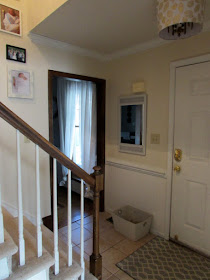
This gold mirror was in the downstairs bath originally and so I moved it into the entryway. I liked it there, but wasn't sure it was the best fit for the space.
I also took the smallest mirror, the oval one, and put it in the living room. I think it looks good here too, but I'm thinking it might be too small for the space. Taking pictures of it helped me decide.
I actually liked having the large rectangular mirror in the bathroom and also moved it to the entryway and living room to test it out. If it stays in the entryway, it is going to get painted at some point- along with the entryway walls- but that is a project for another time. ;)
Also, I really liked how the white blended in with the white walls and trim in the bathroom, but I felt that this mirror wasn't proportionate to the sink area so I tried it in the entryway.
And lastly, I moved the gold long oval mirror into the bathroom and think it fits best here. Since we have gold fixtures on the sink and a gold picture hanging to the right (not pictured) it probably makes more sense to keep this one here.
And below are some more pictures of our spaces.
It is amazing how moving just a few items around in your home can change the look of a space.
Just for fun, I have made some before and after photos so you can see the difference- as if the post and pictures above aren't confusing enough. ;)
**Oh, and in the pictures below, the first picture in each collage shows the look I preferred.
Photo 1- Half bathroom
Photo 2- Living Room
Photo 3- Entryway
What do you think??
Do you prefer one look over the other?


No comments:
Post a Comment
I always love to hear from my readers! Thanks for taking the time to post an encouraging & uplifting comment.