Hi there!
Sorry it has been some time since I have posted here, but that is because I have been posting a few pictures and updates on my Facebook page recently. It has been hard to find a ton of time to post and write about every single project or little thing I complete, but having my Facebook page has helped keep people in the loop with such things.
If you haven't visited or liked my page yet, would you mind doing so?
I would really love the likes and support. I have been dabbling in painting and selling furniture for a while now but the Facebook page is fairly new. I debated for a while on whether or not to start one, but decided to just give it a go...and I am glad I did! It has been fun using that as a resource to post and sell my furniture items.
And speaking of furniture pieces, I am heading to a thrift store soon to pick up a dresser and a nightstand. I have been on the hunt for a dresser to use as a buffet table in our dining room and found one that I want to buy. I am keeping my fingers crossed that it will still be available for purchase this weekend so I can get it and start painting it.
So again, if you could like my Facebook page quickly, that would be awesome! And a BIG thank you to those who have been following along. You guys are amazing and so encouraging!
Here is the link to my page again...you know, in case you didn't see it earlier in this post. ;)
Love Olympia June page
Thanks for stopping by and I am hoping to share some pictures tomorrow on my Facebook page of what I find at the thrift store!

Thursday, October 30, 2014
Wednesday, October 22, 2014
Benjamin Moore's Moonshine
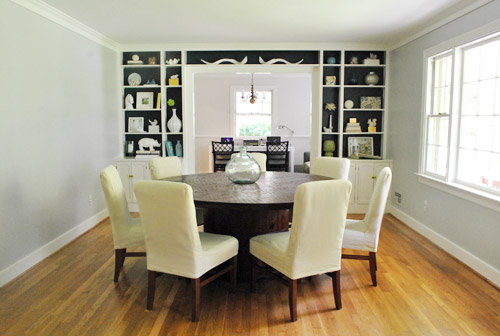
Well, I finally think I can get around to thinking about paint colors for our family room and kitchen. Those areas all flow together because it is one big space and I want to keep the colors neutral in there but also keep them similar. Here is a reminder of how those 2 rooms flow together.

I am still not 100% sure of the colors I will use for the upper walls and the lower walls but I have an idea...that is one step closer to knowing what will go on the walls right? ;)
I was thinking of painting the upper walls in Benjamin Moore's Moonshine. I know it is a hot color right now...so many people are using it which is why I wanted to stay away from it for so long, but every time I saw the paint chip and looked at pictures online, I kept going back to it. So it is a strong contender. The other color I was thinking about was Gray Owl, also by BM, but I really don't think it will look right in those two spaces.
For the bottom walls I think I am going to use Sherwin Williams Shoji White. It is on the same color palette as the color Intellectual Gray I used in our dining room and the color I used on our kitchen cabinets...so that should flow well no problem. I am pretty sure I will use that color on the bottom half of the walls in these two rooms.
Since I am not 100% sure if I will be keeping the wood trim as is in here either, I wanted to use colors that would work with wood trim and white trim...and these 2 colors seem to me to be the perfect choice for that. We will see...I really don't usually buy paint samples and put them up on the walls because that method just never really worked well for me in the past. I think it is important to test out colors though if you are thinking about painting and aren't sure what color to go with because colors look different on paint chips in the store, in different lighting, and on the internet....I know I am being contradictory here but I don't think I will be testing paint colors....maybe it is because I can be pretty lazy too. ;) Yeah, that may be a BIG part of it!
Anyways, here are some pictures of BM Moonshine on the web I found that I really like.
Young House Love image
YHL image


Overall, it is a very subtle color but we don't get a tremendous amount of light in the family room so I am hoping it will be a tad darker than some of these images show it to be.
Also, it looks like it plays well with wood trim, white trim, and pretty much any color.
Who knows when I will actually get time to paint but hoping by the end of the year? ;)
Thanks for stopping by!
Monday, October 20, 2014
New Kitchen Pictures
Hello, hello!!
Hope everyone had a great weekend.
I gotta tell ya, we are loving the weather here. It is really beginning to feel like fall as the leaves change colors and the temperature drops a little here. It makes me excited. :)
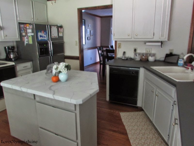
Today I wanted to share with you some updates on our kitchen. I recently painted the countertops, finally, because before I had just primed them. I also painted the island countertop to look like marble (pictures to come on that in this post!). We still have to put up some of the missing crown molding, change out the ceiling fan, and the 80's lighting in the kitchen nook. Hoping to get that done at least by the end of the year, haha!
Here are some pictures that I took of how the kitchen is looking and coming together (with some before and afters).
A Before:


A Before:

I would really love at some point to replace the oven with something a little bit more updated. For now the fridge and dishwasher don't bother me as much because now they blend in a bit more.

I looked up how to paint countertops to look like marble and it looked pretty simple. All I used was some leftover paint that I mixed up together and a feather (yes, a feather) to draw the veins. It actually looks better than I expected but of course it doesn't look completely real. It does look like it was painted on, but I actually am okay with that because I think it looks close enough to the real thing (especially from a distance) and I wanted a marble countertop...so since we can't afford one right now, painting something similar will have to do. ;)


A Before:


The cabinets are painted in SW Worldly Gray; the kitchen island is SW Pavestone.
Some of the hardware we had on hand and used and the rest (the round knobs) we bought at The Home Depot.
At some point I would like to paint the upper walls a warm color and the bottom I would like to do an off white like SW Shoji White. That should brighten and lighten things up a bit more and help things to flow a bit better from room to room. Still more to do but that is always the exciting part.
Thanks for stopping by!
Hope everyone had a great weekend.
I gotta tell ya, we are loving the weather here. It is really beginning to feel like fall as the leaves change colors and the temperature drops a little here. It makes me excited. :)
Today I wanted to share with you some updates on our kitchen. I recently painted the countertops, finally, because before I had just primed them. I also painted the island countertop to look like marble (pictures to come on that in this post!). We still have to put up some of the missing crown molding, change out the ceiling fan, and the 80's lighting in the kitchen nook. Hoping to get that done at least by the end of the year, haha!
Here are some pictures that I took of how the kitchen is looking and coming together (with some before and afters).
A Before:
A Before:
I would really love at some point to replace the oven with something a little bit more updated. For now the fridge and dishwasher don't bother me as much because now they blend in a bit more.
I looked up how to paint countertops to look like marble and it looked pretty simple. All I used was some leftover paint that I mixed up together and a feather (yes, a feather) to draw the veins. It actually looks better than I expected but of course it doesn't look completely real. It does look like it was painted on, but I actually am okay with that because I think it looks close enough to the real thing (especially from a distance) and I wanted a marble countertop...so since we can't afford one right now, painting something similar will have to do. ;)
A Before:
The cabinets are painted in SW Worldly Gray; the kitchen island is SW Pavestone.
Some of the hardware we had on hand and used and the rest (the round knobs) we bought at The Home Depot.
At some point I would like to paint the upper walls a warm color and the bottom I would like to do an off white like SW Shoji White. That should brighten and lighten things up a bit more and help things to flow a bit better from room to room. Still more to do but that is always the exciting part.
Thanks for stopping by!
Subscribe to:
Posts
(
Atom
)